
- 19Mar2015
-
Bollinger Bands using Excel
Bollinger Band was developed by a technical trader John Bollinger in 1980. A band plotted two standard deviations away from a simple moving average is Bollinger Band. The price of the stock is banded by an upper and lower band along with a 21-day simple moving average. Bollinger Bands are a volatility indicator for the Stock prices.
How to interpret Bollinger Band?
Bollinger band is an effective strategy. Interpreting the Bollinger Band will help in finding the stock volatility to make Buy or Sell decisions. Sell is considered when Bollinger Bands are far apart. Buy is considered when the Bollinger Bands are close together.
Target Users
These bands are useful in comparing stock price by the action of indicators to make trading decisions. Bollinger Bands are used widely among traders. Few traders buy when price touches the lower Bollinger Band. They exit when price touches the moving average in the center of the bands. Some traders exit when price go above the upper Bollinger Band. Other than Finance Experts, The International Civil Aviation Organization is also using Bollinger bands as a safety indicator to measure efficiency of safety by determining the accident rate.
Example: Determining the volatility in the Historic Stock Data.
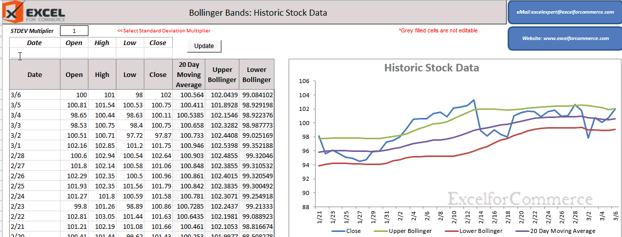
Let’s use Bollinger Band to analyze the volatility in the historic stock data. In this example we are taking sample data from January to March. The four values recorded are Open, High, Low and Close.
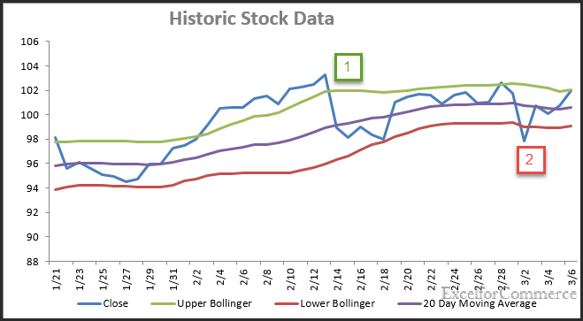
Bollinger Bands consist of a middle band with two outer bands. The middle band is a simple moving average that is usually set at 20 day moving average (Purple Color). The outer bands are usually set 2 standard deviations above and below the middle band. The upper Bollinger band is indicated in Green color. The lower Bollinger band is indicated in Red color. The close price is indicated with Blue in color. (As shown in the image below)
How to use our template?
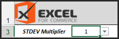
Select the required Standard deviation multiplier from the dropdown provided in the Excel file (free download link at the end of the blog).
Based on the standard deviation and the multiplier, the Lower Bollinger and Upper Bollinger values gets updated. We can decide whether to buy or sell based on the graph. As we can see from the graph Image above, instance 1 is above the Upper Bollinger (Green). These are considered as sell periods. Selling at those periods will turn out to be profitable. Whereas, Instances 2 is below the lower Bollinger band (Red). This period is considered as Buy period as the price is low and is apt time to invest.
Download the free Bollinger Bands template here: Bollinger Bands.xlsm.
If you want to customize your template where you can directly download ticker data from third party websites or even if you have any questions, feel free to Contact us here.
- 19 Mar, 2015
- Excel for Commerce
- 1 Comments
- bollinger bands, bollinger bands template, investment tool, stock investment tool,
Comments
-

-
Ronald
- May 17 2021
-
Thank you so much for making this excel sheet, I just started to learn about Bolinger starting to enter data.
I started from may 1 until may 11 then something went wrong, day 12 became 03-12 in the excel sheet and day 13 can't be processed
Could you help me out to change the excelsheet?
Greetings,
Ronald