
- 07May2015
-
How to Analyze Large Data Sets in Excel
Ever wanted to use Excel to examine big data sets? This tutorial will show you how to analyze over 300,000 items at one time. And what better topic than baby names? Want to see how popular your name was in 1910? You can do that. Want to find the perfect name for your baby? Here’s your chance to do it with data.
There are professional data analysts out there who tackle “big data” with complex software, but it’s possible to do a surprising amount of analysis with Microsoft Excel. In this case, we’re using baby names from California based on the United States Social Security Baby Names Database. In this tutorial, you’ll not only learn how to manipulate big data in Excel, you’ll learn some critical thinking skills to uncover some of the flaws within databases. As you’ll see, the Social Security database, which goes back to 1880, has some weird and wonderful anomalies that we’ll discuss.
This tutorial is for people familiar with Excel: those who know how to write, copy and paste formulas and make charts. If you rarely venture away from a handful of menu items, you’ll learn how to use built-in Excel features such as filters and pivot tables and the extremely handy VLOOKUP formula. This tutorial focuses on what’s called “exploratory analysis”, and will clarify the steps to take when you first confront a huge chunk of data, and you don’t know in advance what to expect from it. We’ll also show you how to use these tools to find the flaws in your data set, so you can make appropriate inferences. If you want to improve your Excel chops with some big data exploration, you’re in the right place.
Note: This tutorial uses Excel 2013. If you’re using a different version, you may notice some slight differences as you go through the steps.
Download the data and import it into Excel
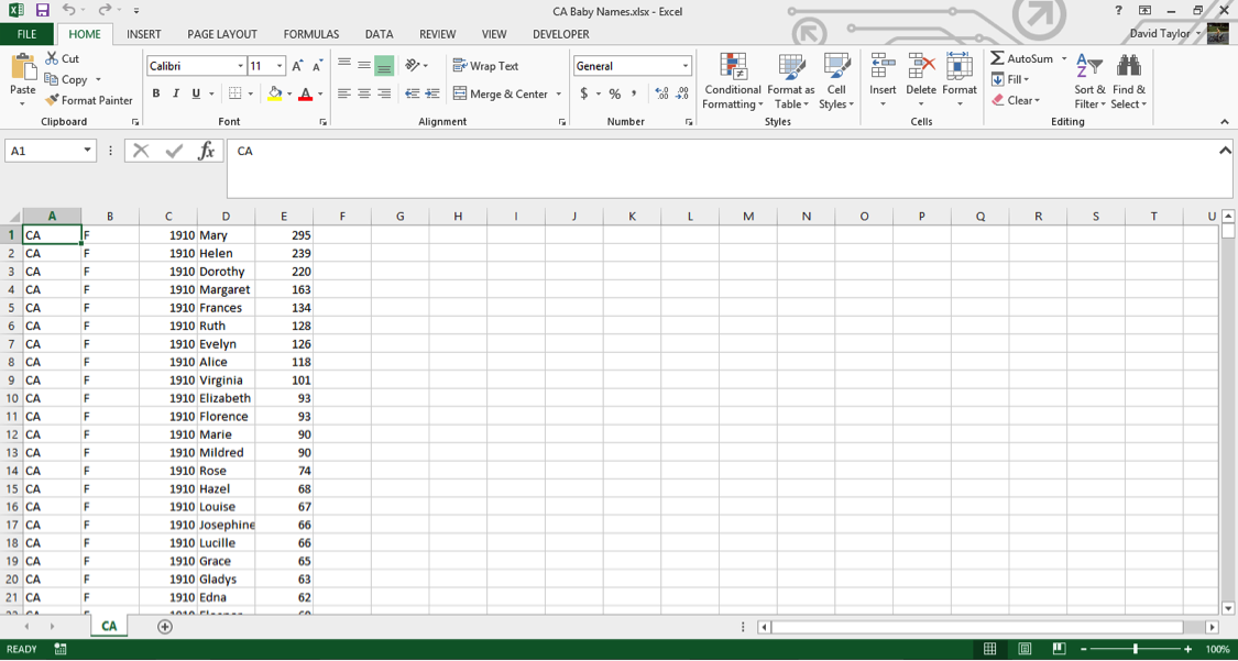
Download the state-specific data from http://www.ssa.gov/oact/babynames/limits.html. You’ll find a file named namesbystate.zip in your download folder. Extract the California file: CA.TXT. (In Windows, you can just drag the file out of the archive.)
Launch Microsoft Excel, and open CA.TXT. If you don’t see the file in your dialogue box, you may have to choose Show All Files in the dropdown box next to the file name box.
In the Text Import dialogue box, choose Delimited, then Next, then Comma, then Finish. This tells Excel to treat commas as column separators. Save your file as an Excel Workbook file called CA Baby Names.xlsx. Your workbook should look similar to this:
Note: the number of rows in various parts of this tutorial are based on the Social Security Baby Names file going until the end of 2013. Depending on when you are doing this tutorial, the files may have been updated with data from later years, so the number of rows may be larger. Keep this in mind if the last row specified in this tutorial is slightly less than what you see on the screen.
Select the first column, A, and delete it; all of your data in this file is from California, you don’t need to waste computer resources on that information. Insert a new row above Row 1, and type column headers: Sex, Year, Name and Births. Your workbook should now look like this:
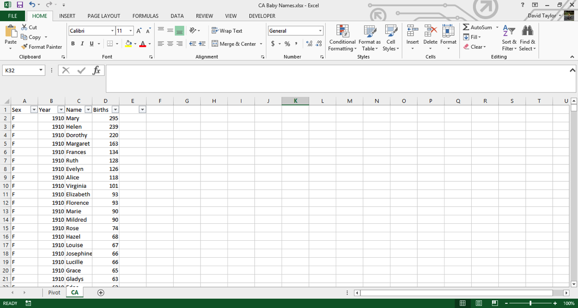
Use Filters
Filters are a powerful tool to drill down into subsets of your data. Press Ctrl-A or Cmd-A on Mac (from now on, I’ll just write Ctrl) to select all your data, then in the Home Tab select Sort & Filter, and Filter. Your data column headers now have triangles to the right of each cell, with dropdown boxes. Let’s say you wanted to look up only the first name ‘Aaliah’. Click the triangle to filter the Name column, click the Select Allcheckbox to deselect everything, then click the checkbox next to ‘Aaliah’. You should see the following:
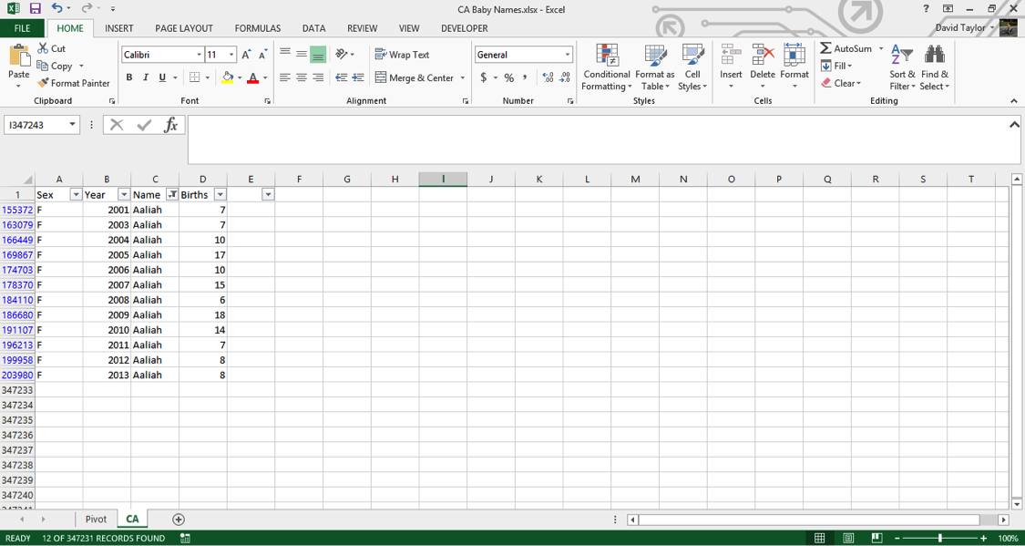
You can see that the row labels at the left of the screen only show the rows in which ‘Aaliah’ appears in the Name column. You can filter on multiple conditions in a column (for example, ‘Aaliah’ and ‘Aaliya’ in the Name column) and/or filter using multiple columns (for example, only certain years). Sanity Checks
When doing data analysis, it’s essential to take a step back every now and then and ask, “do these results make sense?” This is especially important when you are changing the values of cells in an Excel Spreadsheet; if you make a mistake and change your data, it can be difficult to track down the error later.
But sanity checks can also be used to check the state of the data as it came to you. Use the filter to select only the name ‘Jennifer’, and have a look at the results. The following things should stand out:
- On your way down the list, there were quite a few names that were almost, but not quite, spelled ‘Jennifer’, like ‘Jennfier’ and ‘Jenniffer’. Some of these are alternate spellings given by parents who want an unusual name, but it’s possible some are typing errors by the clerks who recorded the data. There’s no way to determine which are errors and which are intentional, but you should bear these possibilities in mind. Datasets are rarely perfect, and this is especially true the larger they get.
- There are quite a few boys named ‘Jennifer’ in this data. Again, it’s possible some adventurous parents gave boys a traditionally female name, but if you look through names of medium popularity or better, you’ll find a small percentage is always of the other sex. This odd consistency makes it probable that a good proportion of these are also due to errors in the dataset. If you wanted to just consider the girls named ‘Jennifer’, you could filter the Sex column.
Summarize with Pivot Tables
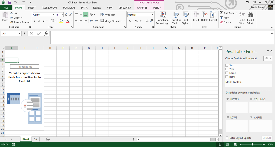
The Pivot Tables feature is a powerful tool that allows you to manipulate and explore the data. Here, we’ll use it to find out how many names and births are in the database for each year. First, select columns A through D, so they are highlighted. Then click the Insert Tab’s leftmost button, PivotTable. In the dialogue box that appears, make sure the Table/Range radio button is selected and the accompanying text box reads CA!$A:$D (if you selected columns A through D correctly earlier, this should be the default. If not, type it in exactly as written. The CA is the name of your data worksheet, taken from the CA.TXT filename you started with).
In the bottom of the dialogue box, make sure the New Worksheet radio button is highlighted, then click OK. A new worksheet appears, named Sheet1 – right click on the Sheet Tab and rename it something like‘Pivot’, since it’s a good habit to always have descriptive sheet names instead of uninformative default ones. Your screen should look like this:
If you’ve never used an Excel pivot table before, it takes some getting used to, but it’s not too complicated, and it’s well worth the effort. Once you’ve followed the instructions here, we recommend playing around with pivot tables to get to know them better.
In the menu on the right, click the checkbox next to the Year field. Year now automatically appears in theROWS box on the bottom left of that menu, which is exactly what you want. Now click the Births checkbox, and drag the Births that appears in ROWS to the right into VALUES.
Your screen will now look like this:
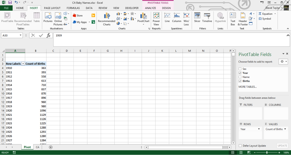
A few things should be noted here: the title of the rightmost column, Count of Births, is a little unclear. In data analysis, ‘count’ always means the number of rows in a category, regardless of the value in the cells in that row. So what you are seeing here is: for each year in the database, the number of unique male names plus the number of unique female names. You can see that as time progresses from 1910 to 1927, there are more names per year. Does this mean parents are picking more diverse names for their children? Maybe – that’s what you want to find out with further analysis.
Clarity and explicitness are important. Whenever you create a computer document, you should do so with the philosophy that if you open it again six months from now, you will immediately understand what you’re looking at. With that in mind, click on the cell where it says Count of Births and change it to Unique Names.
Bear in mind, when you’re working with pivot tables, the menu on the right will disappear anytime you don’t have a cell of the pivot table to the left selected. If that happens, just select a cell in the table, and you’re good to go.
Add a PivotChart
When it comes to quickly understanding data, nothing beats a chart. (Most people call charts “graphs”, but technically a graph is a complicated network visualization that looks nothing like what you’d expect, so Excel properly calls them charts.) Our visual senses are powerful, and are able to immediately understand patterns and trends when they are abstracted into the form of bars and lines.
Make sure your pivot table is selected, then in the Insert Tab, click PivotChart. In the next dialogue box, the default is a bar chart; this will work, but it will be easier on the eyes if you select a line chart, then click OK. You may find it easier if you resize the chart so that the bottom x-axis shows intervals of five and ten years, since we tend to think of years in terms of decades. Your screen should look like this:
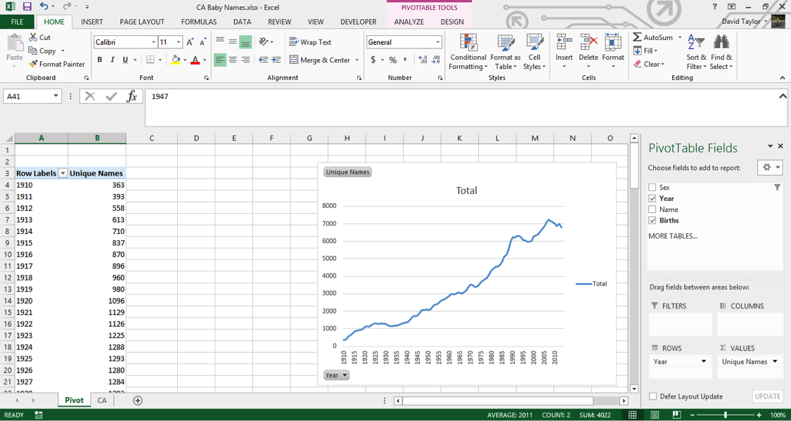
Again, we’re seeing an increase in the number of unique male names and unique female names per year. But what if you want to know the number of births themselves? With Excel’s pivot table, that’s easy to do. You could modify your single column, but it is usually more informative to add a new column so you can compare, contrast and calculate.
In the right-hand menu, under Choose fields to add to report, drag the bold checkboxed Births down to theVALUES box in the lower right. You now have two columns, Unique Names and Count of Births (Excel has given this column the same default name it did before). Click the downward-facing black triangle to the right of Count of Births in the VALUES box, and select Value Field Settings from the context menu (the menu that pops up when you right-click). In the resulting dialogue box, change the highlighted Count to Sum.
Your new column’s header name is wrong, so click in its cell and type Number of Births (just “Births” would have been fine, but Excel won’t let you give a pivot chart column the same name as one of the columns it’s based on). A new line has been added to your pivot chart, but because the number of births is so much greater than the number of names, it’s compressed down to near the x-axis. The solution for this is to put it on a secondary y-axis. Click on the compressed series so it’s selected. Right-click and choose Format Data Series from the context menu. Then, choose the Secondary Axis radio button, and click the X in the top right of the Format Data Series panel to dismiss it. Now you should see this:
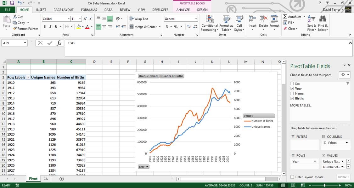
If you see something different, don’t panic. Go back and follow the steps closely, using this screen as a guide to what you should see.Let’s study the shapes of the Unique Names line (in blue in the figure above) and the Number of Births line (in orange above). They both have a generally increasing direction, as you would expect, and often move in tandem (especially from 1910 to 1935 and 1975 to 2000). The number of births increases rapidly during the Baby Boom starting around 1940, peaks around 1960, and peaks again around 1990 and 2005.
Another Sanity Check
Whenever possible, it’s a good idea to get a second opinion about data: you weren’t involved in its collection or curation, so you can’t vouch for its accuracy. Just because a government department publishes a dataset, doesn’t mean you should trust everything in it 100%. (Please believe me, I speak from experience!)
In this case, it’s easy to double-check. Googling the terms ‘California birth rate’ leads us to the California Department of Public Health, and documents such as this one —http://www.cdph.ca.gov/data/statistics/Documents/VSC-2005-0201.pdf — which show the same trends (after 1960, anyway, where the CDPH data starts) as in the Baby Names data. However, it appears that the overall number of births is greater in the CDPH records than in the dataset we’re working on. For example, in 1990, the Baby Names data shows about 550,000 births, while the CDPH shows 611,666.
That’s why it’s a good idea to know your dataset, and read up about how it was collected and what it contains (or what it leaves out). The background information given by the Social Security Administration about this dataset at http://www.ssa.gov/oact/babynames/background.html andhttp://www.ssa.gov/oact/babynames/limits.html points out that any names with fewer than five births is left out, to protect the privacy of the names’ holders. So it’s plausible that the 60,000 missing births split among people who shared their name with fewer than five other people.
Explore your data and uncover insights
The pivot table and chart we’ve created are based on all of the data. However, there’s a natural and obvious division within the topic of baby names: male and female names. For one thing, more boys are born than girls (about 4% to 8% more, due to biological and environmental factors). Also, there are different social pressures on parents when naming boys and girls; we’ll see evidence of this soon.
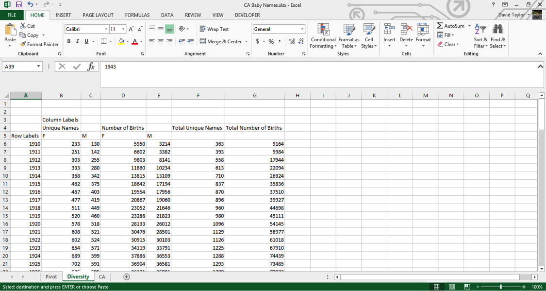
Luckily, with pivot tables, it’s easy to separate out the sexes. Just drag the Sex field name next to the checkbox in the upper right down to the COLUMNS box. Click the filter icon at the right of the new cell named Column Labels at the top of the pivot chart. Make sure F and M are selected, but (blank) is not – there are no blank values for Sex in this dataset, which you could easily verify by looking at the column totals with (blank) selected.
Where you had two columns before, now you have six: Unique Names and Number of Births for females, males and both together. Here is what you should see:
(Note: I clicked in a non-pivot table cell and moved the chart over so everything fits on one screen.)
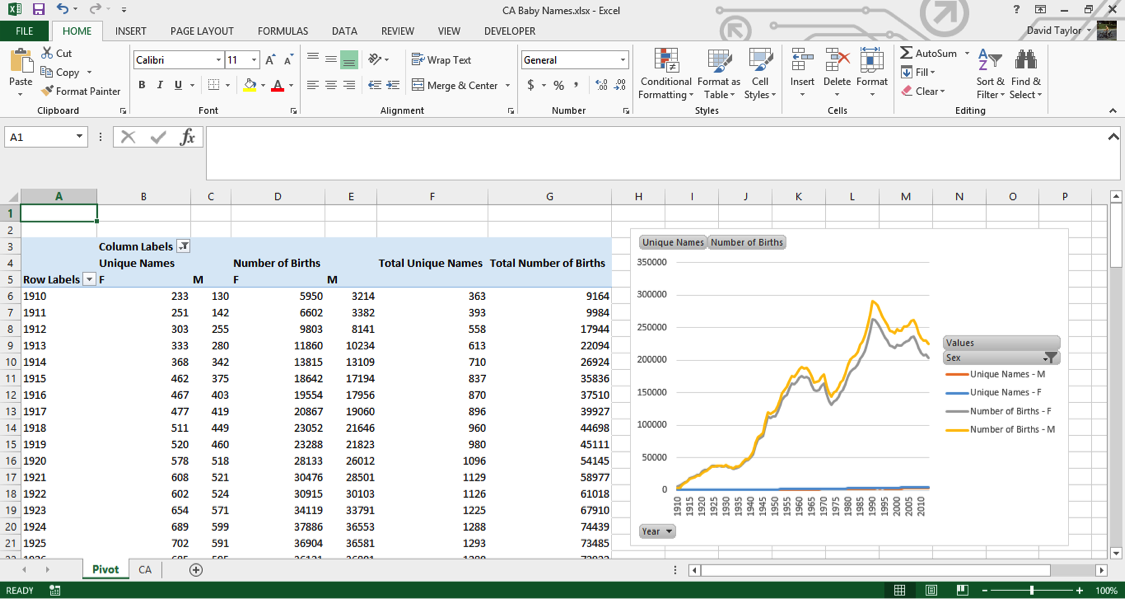
Unfortunately, your pivot chart has lost its secondary axis. You could go back and reassign both Number of Birth lines to the secondary axis, but here is where it’s a good idea to stop using pivot tables and copy everything into a regular Excel spreadsheet. Why? Pivot tables are powerful, but they’re not flexible. You can add calculated columns, but it’s needlessly complicated. Pivot charts are even more limited: they will always show all the data in a pivot table. For example, if you wanted to limit the chart to only female names, or only totals, we’d have to change the pivot table itself.
So highlight columns A through G and copy them. Then, create a new worksheet, and right-click in cell A1, and select Paste as Values (or just press the ‘V’ key). Resize the columns so all the text fits, and rename the sheet Diversity (since that’s what we’ll be looking at). ‘Diversity’, by the way, is simply the average number of names per birth. Its maximum possible value is 1, which would only happen if every baby born had a different name.
You should see this:
We’re not interested in the totals anymore, so go ahead and delete columns F and G (this will give us more screen real estate). Replace them with Diversity in F4, F in F5 and M in G5, and in cell F6 type the formula=B6/D6. Copy this cell, then select cells F6:G109 and paste. At the bottom of your spreadsheet, in Row 110, there are totals. You should delete these, because they’re potentially confusing, and it doesn’t make sense to add together this kind of data for all years.
Now you’re ready to add a chart. Select cells A5:A109, press Ctrl/Cmd, and select cells F5:G109 (the female and male diversity ratios, plus the column headers, F and M). Then in the Insert Tab select the scatter chart with straight lines, as shown here:
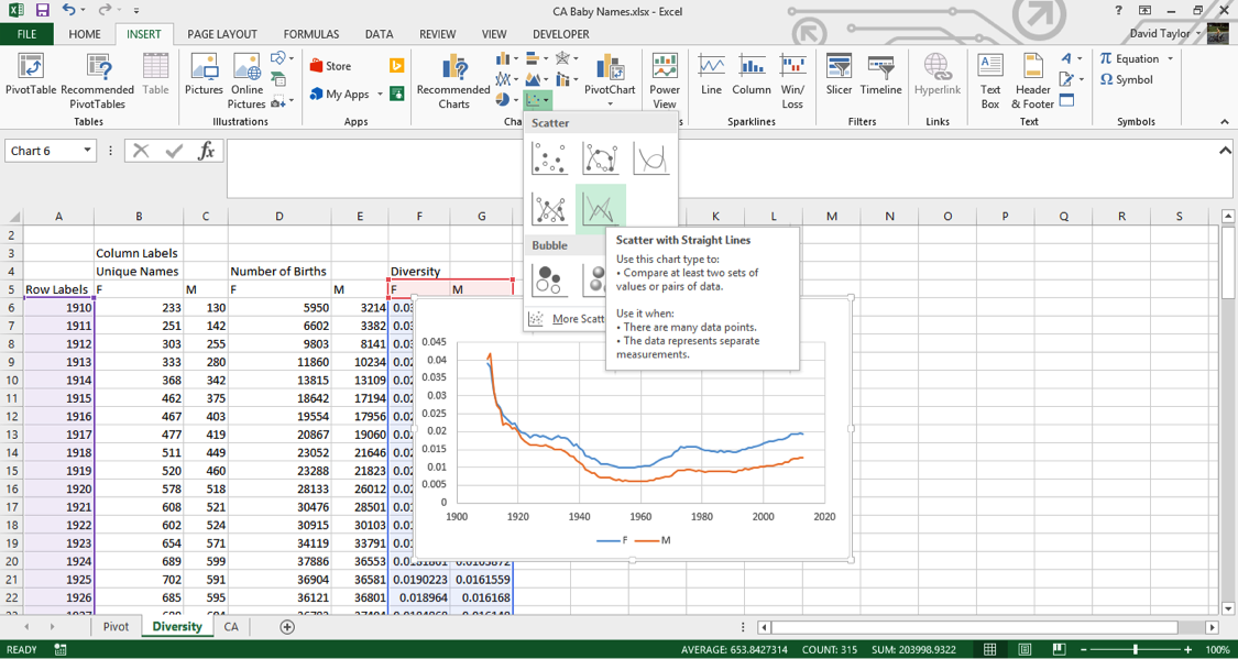
You should always label the axes of charts, so with the chart selected, use the DESIGN tab and add these features. (In Excel 2013, click on the Add Chart Element button at the left; the procedure is slightly different for other version of Excel). Name the x-axis Years and the y-axis Names per birth and, while you’re at it, change the chart title to Diversity.Ignore the first half of the graph for now: let’s look at 1960 to present. As one would expect from anecdotal experience, there is more diversity in names now than there was fifty years ago. In addition, female names are more diverse than male names. Perhaps parents want their girls to stand out more? It’s interesting that the changes in diversity tracks pretty closely between the sexes. This suggests that the difference is due to something intrinsic to the difference between girls’ and boys’ names, not momentary trends. Perhaps the explanation is simple: there is more diversity in girls’ names because there are more spelling variations in girls’ names, like ‘Ann’ and ‘Anne’ and ‘Anna’.
The train of thought outlined above illustrates the kind of mindset needed in exploratory data analysis. Insights come from looking beneath the surface and the obvious interpretation, by questioning everything (including the data itself!), and by considering all possibilities.
With that in mind, take a look at the graph from 1910 to 1960. The maximum amount of name diversity happens in the first years of the data. Does this seem plausible to you? Were parents giving their kids wild and unique names during World War I at twice the rate as today?
If there’s something that doesn’t make intuitive sense in the data, it’s time for a sanity check. A good strategy is to check something else that, if the data is accurate, should be true. Human sex ratio at birth was mentioned above: it should always be between 103 and 108 boys born per 100 girls born. That seems like a good place to start.
Determine Important Ratios
You can just add more columns to the Diversity spreadsheet. Move the chart out of the way to make room.
Call the new group of columns Sex Ratio, and write three column labels in cells H5:J5 — Actual, Minimum and Maximum. Type the formula =100*E6/D6 into cell H6, and the numbers 103 and 108 in cells I6 and J6, respectively. Copy the contents of H6:J6 and paste into cells H7:J109.
Now to make the chart. Select cells A5:A109 (which contain the years), hold down Ctrl/Cmd and select your new data in H5:J109. In the Insert tab, insert a scatter chart with lines as you did above. Add a title and axis labels. You should reformat the y-axis, so that you can visualize the data more clearly. (Usually you want the y-axis to go all the way to zero, but in this case the y-axis can’t possibly go down to zero (if there were no boys born, the human race would die out, right?) Select the numbers on the y axis, right-click and choose Format Axis from the context menu, in the resulting dialogue box type 50 in Minimum and 120 inMaximum and click OK.
Here is what you should see:
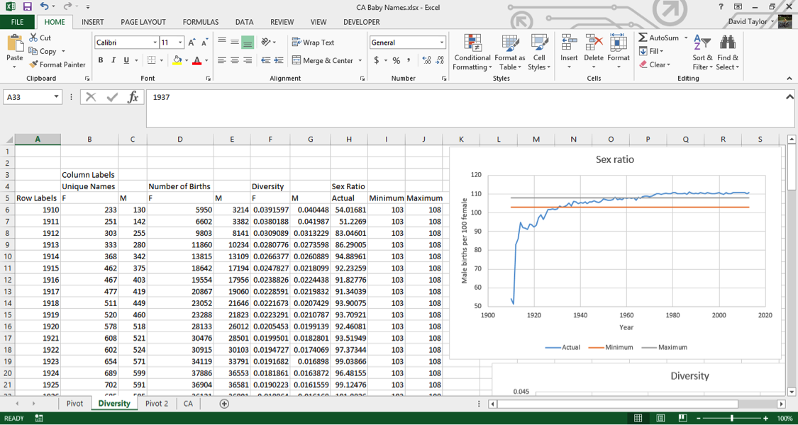
As you can clearly see, this data does not display the accepted sex ratios for humans. In fact, in the first few years it’s way, way off. In the 1910s, there are only half as many boys as girls being born.The reason for this is quite simple, and unfortunate. If you look at the landing page for this dataset athttp://www.ssa.gov/oact/babynames/, you can see the U.S. Social Security Administration calls it a baby names dataset, and even has graphics of babies, but the fact is, many of these names are not of babies: they’re names of adults, and not even a representative sample of adult Americans.
If you look at the Wikipedia entry for History of Social Security in the United States at https://en.wikipedia.org/wiki/History_of_Social_Security_in_the_United_States, you’ll see that Social Security only started in 1937. Yet your data goes back to 1910, and for some other states it goes back as far as 1880. How can that be? Well, those with a 1910 birth year were at least 27 years old when they applied for Social Security. They applied, at the earliest, in 1937, and gave their birth year. This means people who died before the age of 27 are automatically excluded from the data (and infant and childhood mortality was far higher in the 1910s than it is today.) Also, Social Security was not a universal program then as it is today. Only those on a list of accepted occupations could join, which in practice, meant middle-class white people, so there is a social and ethnic bias to the dataset before the rules were relaxed in the 1950s.
Why are there more women than men in the early years? Because women live longer than men. They had less chance of dying before they could apply for Social Security, and outlived their husbands which meant they needed to apply in their own name in order to receive their husbands’ benefits.
It’s worth pointing out that it was unusual for Americans to give babies a Social Security number at all before 1986. That’s the year the IRS started requiring them to claim a child as a tax deduction. Before that time, it was usual for people to apply for a Social Security number when they filed their own first tax return, usually in their late teens.
Finally, why is the sex ratio in the dataset above normal values starting around 1970? This one is easier to figure out, because it’s something you saw in the Diversity graph. There are more girls’ names than boys’ names, and the dataset leaves out names belonging to fewer than five people for privacy reasons. That means that more girls’ names than boys’ names are excluded from the dataset, so the ratio of boys to girls is a little higher.
Does this mean this dataset is useless? Absolutely not. All datasets have strengths and weaknesses. The important thing is knowing what they are, so you don’t draw unwarranted conclusions. (For example, you would probably hesitate to declare the top boys’ names of 1910, but you’d have a lot more confidence in 2000.) With that in mind, let’s do some more common analyses of the data, and at the end, you’ll be able to see what it means for a ‘baby names’ dataset to actually contain adults names.
Graph individual data points and trends
When you have data that is naturally divided into subcategories (in this case, years), it’s a good idea to calculate some statistics just in terms of that subset. For example, if you wanted to calculate the #1 names overall, it would be difficult to do that for the entire dataset, because there are more births in the 2000s than in the 1910s, so in practice the result would be the “#1 name overall, but mostly nowadays.”
It makes a lot more sense to compare, for each row, the percentages of births of that name and sex that year to all births of that sex that year, and rank them. (For example, this will allow you to determine the popularity of the name ‘Evelyn’ relative to ‘Margaret’—and every other name.) Here’s how you do it.
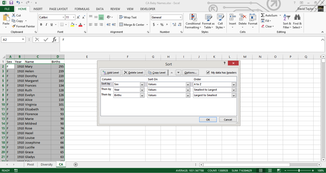
Go back to your CA worksheet. The data, as downloaded, should already be sorted the way you need it, but you should never take such things for granted. Select columns A:D, in the Home tab click the Sort & Filterbutton on the right, choose Custom Sort and use the Insert button to have three rows of criteria. Make these criteria Sex A-Z, Year Smallest to Largest and Births Largest to Smallest as shown in the following figure, then click OK:
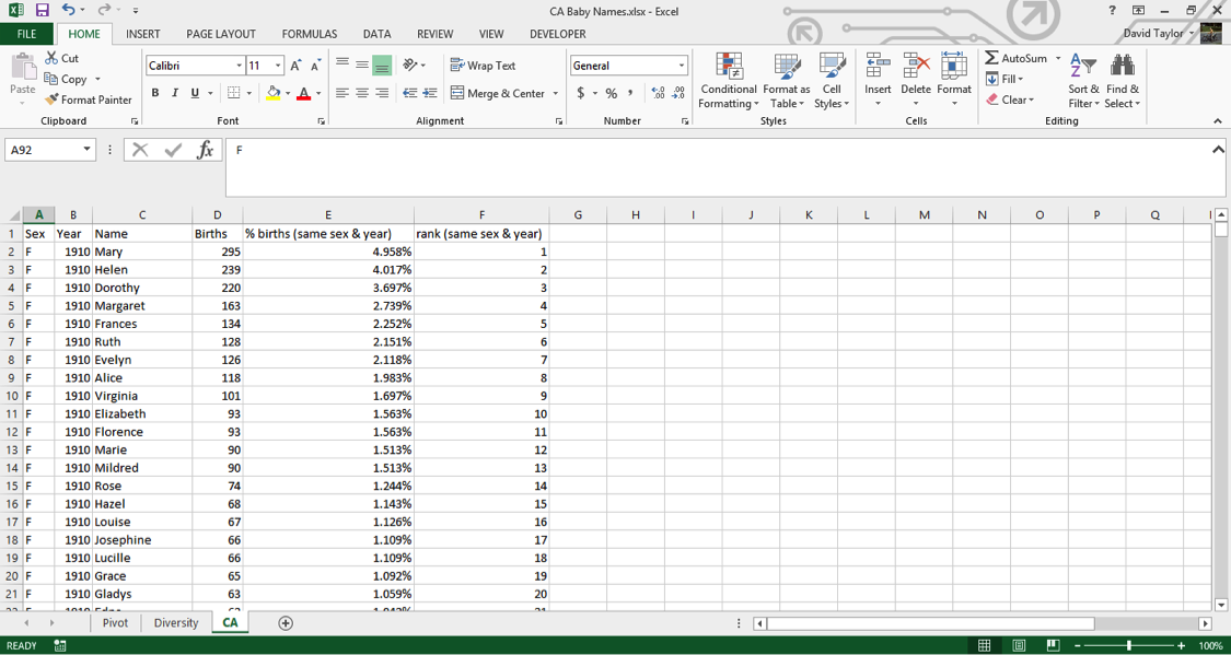
Now you can add your new columns. Type new headers in E1 and F1: % of Births (same sex & year) and Rank (same sex & year), respectively. These column names might strike you as a little long, but it’s best to err on the side of clarity. If someone else has to look at and interpret your work, or even if you have to return to it weeks or months later, it’s best that everything can be understood as easily as possible.
For your % of Births column, the concept is easy: divide the number of births in that row, e.g. 295 for Mary in 1910, by the total number of births of that sex and year, e.g. female births in 1910. Where can you find that information? In the pivot table you made at the beginning of the tutorial. YES!
Take a look at that pivot table. The information you need to access is in Columns D to E is. Luckily Excel has a few different functions you can use to look up data in other worksheets; the easiest is the VLOOKUP function.
Go back to the CA worksheet and type the following into cell E2:=D2/VLOOKUP(B2,Pivot!$A$6:$E$109,IF(A2=”F”,4,5),FALSE)
If you’re not familiar with the VLOOKUP function, here’s a breakdown of all of the arguments:
- D2: that’s the number of births for Mary in 1910, which you’ll divide by all female 1910 births.
- B2: that’s the year you want to look up, in this case 1910.
- Pivot!$A$6:$E$109 tells the function to look in the range of the Pivot spreadsheet with the years in the leftmost column and the total births, female and male, in the two rightmost columns. This is what will be matched with the value in B2. The dollar signs are important. They tell Excel not to move the lookup range down as you copy the formula down.
- IF(A2=”F”,4,5) tells the function what column to look in for the results. If your row is a female name, it will look in Column 4, otherwise Column 5.
- FALSE tells the function to return an error if it can’t find the year in the Pivot worksheet. This shouldn’t happen, but it’s good to be explicit here, so that if something goes wrong, you’ll know about it!
You should see the value 0.049579…. Copy this cell and paste it into every cell of Column E below it. It might take your computer a second or two (or three or four…), depending on how powerful it is, to calculate all of these values (there are over 300,000 of them, after all). To avoid having to wait for recalculations in the future, select all of Column E, copy it, and Paste as Values. This is safe to do because you can be confident the underlying values being calculated will not change in the future.
One of the good features in Excel is that it can display percentages without changing the underlying value. In other words, you don’t need to multiply your results by 100, and then divide by 100, if you want to use them in a calculation. Select Column E and use the Number Group on the Home tab to change the formatting to percentage with three decimal places.
Now is a good time for a sanity check. In any blank cell, type the following: =SUMIFS(E:E,A:A,”F”,B:B,1910). This tells the function to add together the values in Column E only for those rows where Column Acontains F and Column B contains 1910. The result should be 1, i.e. 100%. If you replace F with M and/or 1910 with any year in the dataset, the value should always be 1. Now that the integrity of your data has been verified, you can delete that cell.
Now you can add the values in the ranks column. There are ways to use Excel functions to calculate ranks of subsets, but they’re complicated and slow. Since you’ll be pasting as values later anyway, why not do it the quick and easy way? All that is required for this method is that the data be properly sorted, and you did that earlier.
In cell F2, type the following: =IF(B2<>B1,1,F1+1). This tells Excel to start counting ranks when there is a change from row to row in the Year Column B. (If there is a change in the Sex Column A, there will also be a change in the Year column because of the way you sorted the worksheet earlier.) Excel will give the most common name a rank of 1 because earlier you sorted the worksheet so that births are in descending order. Wherever there isn’t a change in the Year column, Excel increments the rank, i.e. 1, 2, 3, 4, …
Copy F2 to the whole range of Column F, then copy the whole column and Paste as Values. Finally, your worksheet should look like this:
Visualize your data
Now that you have these calculated columns, you can use filters as you did above to find the top names in each year. Select Columns A:F, and in the HOME tab, under Sort & Filter, choose Filter.
Now click the filter icon in cell F1 and select only the names of rank one (i.e. the #1 names of each sex of each year). You can see that Mary dominates until the 1930s. Then Mary, Barbara and Linda alternate until Linda wins out for 10 years. Lisa, Jennifer, Jessica and Emily have solid runs later on, then Isabella and Sophia are the top name for three years each. Among the boys, John, Robert, David, Michael and Daniel give way to Jacob for the last few years.
If you look at the percentage column, you can see that the #1 name takes up a smaller and smaller part of all the names as the years go by. This is further evidence of the increasing diversity of names over time, and unlike the diversity measure you calculated before, nothing unexpected happens in the early part of the dataset.
Now you can use the filter tool to visualize individual names. The first thing to do is sort the names; this extra step will make it possible to make charts of the results. Be warned, with over 300,000 rows, this could take a few minutes depending on the power of your computer, but it only has to be done once. Click on the filter icon in the Names column header, and choose Sort A to Z.
Once the sort is completed, use the filters to choose ‘F’ for sex and ‘Heather’ for name, then use theCtrl/Cmd key to select the year and percent values in Columns B and E, respectively. Insert a chart, and you should see the following:
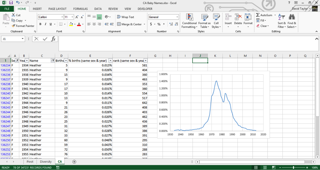
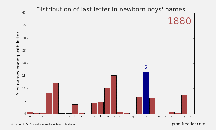
If you explore these names, you’ll see this sort of pattern more often with girls’ names than boys’ names: a quick rise from obscurity to popularity, then as the name becomes too trendy, a descent to obscurity again. The closest parallel you can see with boys’ names is a more general pattern, those of names ending in ‘n’. Look up names like Mason, Ethan and Jayden, you’ll see them all rise from obscurity to prominence in the 2000s, and many of them are just starting to dip again as of 2013. Below is the simple representation for the Distribution of last letter in Newborn boys names.
Remember what was written above about much of this dataset being adult names instead of baby names, because babies only routinely had Social Security numbers starting in 1986? You can see this in the data too. For example, a baby would be much more likely to have the name “Peter” on his official documents than the nickname “Pete”. But if, when a young man or older filled out a tax return or applied for Social Security, he would be more likely to use the name he went by in day-to-day life, which might be a nickname he’d been called since he was a boy. You can filter the sex for M and the names for ‘Pete’ and ‘Peter’, and either make two charts or put the series on the same chart. Putting two series from the same column on one chart involves using the Select Data chart context menu item, which is beyond the scope of this tutorial, but it’s not that difficult. Have a look at the result:
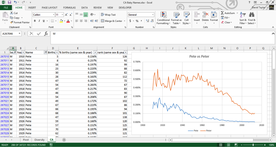
In the beginning of the dataset, ‘Pete’ is about half as popular as ‘Peter’. Starting at almost exactly 1937 when Social Security numbers were introduced, ‘Pete’ starts a decline in popularity while ‘Peter’ stays relatively constant – this indicates that people are starting to put their birth names on Social Security applications. The decline of ‘Pete’ bottoms out at almost exactly 1986, when it became commonplace for babies to have Social Security numbers.
Hopefully, you found this tutorial enjoyable and interesting. The important lessons to take away from this are that you can manipulate large datasets in Microsoft Excel, and datasets often aren’t exactly what they seem!
Source: https://www.udemy.com/advanced-microsoft-excel-2013-online-excel-course/#exceltutorial
- 7 May, 2015
- Excel for Commerce
- 0 Comments
- analyze large data sets, Excel Consultant, Excel Expert,
Comments